Why theming in Flutter is confusing (to me)

About two weeks ago I posted the following tweet:
Reactions to this tweet were pretty divided. Some people agreed with me, and some people thought the theming in Flutter was just fine.
In this article, I will try to explain exactly why I think theming in Flutter is confusing.
What is a 'theme'?
If I look up the definition online, this is one of the first I find:
A design theme is simply the overall look and feel of a website. The purpose of a design theme is to create unity across web pages through the consistent use of a color palette, fonts, and layout patterns
- Uizard Technologies
Using a 'Theme' in your app creates unity and consistency across your application. When an application uses the same theme across its different screens, it lets the user know they are still inside the same application.
Theming your Flutter app
Flutter allows you to 'style' elements in your app through the use of ThemeData objects which are provided by the Theme widget. All the Material Widgets in Flutter reference the ThemeData to cherry-pick its properties to be used as their default styling.
I say default because the Material Widgets also allow you to override the style of the component themselves.
What style is used where?
How ThemeData is used by the Material Widgets is the first thing that confuses me. Material Widgets sometimes access different properties from ThemeData, depending on whether they have been supplied or not.
Let's take the AppBar Widget as an example.
If we want to change the text style of the title, we have several options.
We can set the
titleTextStyleproperty on the widget itself.If that is
null, it will try to get the style fromThemeData.appBarTheme.titleTextstyle.If that is also
null, it will get a more generic text style fromThemeData,ThemeData.textStyles.titleLarge.
But, instead of using that style's color, it will use theAppBar.foregroundColorproperty.If the
AppBar.foregroundColorproperty isnull, it will try to use theThemeData.appBarTheme.foregroundColor.However, if that is also
null, it will useThemeData.colorScheme.onPrimaryfor the color. Unless the theme'sBrightnessis set toBrightness.dark, because then it will useThemeData.colorScheme.onSurface.
This is just for styling one part (the title) of one component (the AppBar).
Which style to use?
The next things that confuse me are the more generic style properties in ThemeData.
ThemeData contains a set of generic TextStyles located in ThemeData.textTheme. It contains a bunch of old and new Material Design-defined styles for texts. If we ignore the deprecated styles and focus on the ones defined in the latest Material Design version, we have the following set of styles:
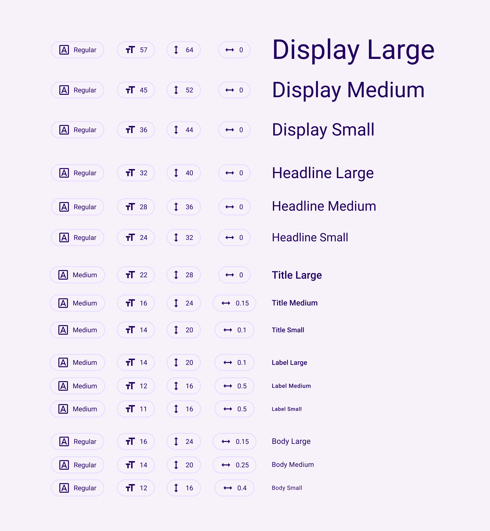
Now I ask you, do these definitions make any sense to you? Where should they be used for?
Take a look at the image below. It's the well-known counter app...
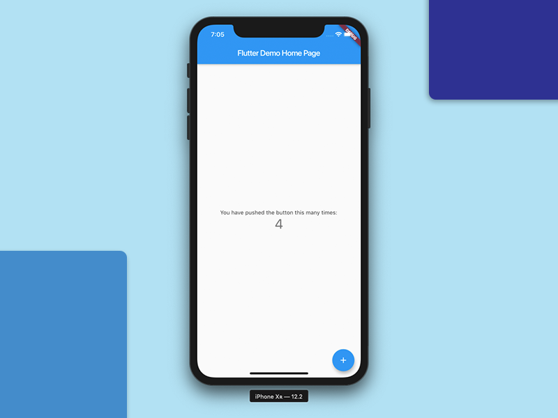
Can you tell me which TextStyles have been used for the number and the text above it, without looking into the code. I bet you cannot.
It turns out the number is using ThemeData.textTheme.headlineMedium, and the text above it uses ThemeData.textTheme.bodyMedium. But why? Why these properties, why are these 'medium' sized? Why aren't they 'small' or 'large'? Why is the number a headline?
ColorScheme is very similar and has the same issues, so I won't cover them here.
'Theming' in multiple places
If theming is about having a consistent design across your app, then we have two options for achieving that in Flutter.
I've always had the feeling that Flutter pushed us toward using ThemeData. But sometimes we also make reusable components when ThemeData just isn't enough, like a type of ProductCard we use on both a Search and Favorites page.
By using reusable components, you technically are also 'theming'. The final result is often a mix of the component's configuration and the current Theme.
I always have to think about where which configuration should go, it just isn't clear to me.
ThemeData's rigid structure
The ThemeData class is rigid. It is not easy to add properties by extending the class for example. That's because when you want to use the Theme in your UI, the Theme.of() static function will return a Theme, meaning you will only see the properties Theme originally has.
There are some ways to work around this but they are a pain in the butt.
ThemeData also has a way to add ThemeExtensions (docs). This is just a list of classes that extend the ThemeExtension class which can be accessed by calling .extension<MyThemeType>() on a ThemeData instance.
My issue with this is, that if I just want to add a single TextStyle, let's say titleExtraLarge, I will have to add it as an extension. So, they will not be located in the same location as the other TextStyles, which again makes it confusing to work with.
Property overload
ThemeData by default gives you access to all these properties:
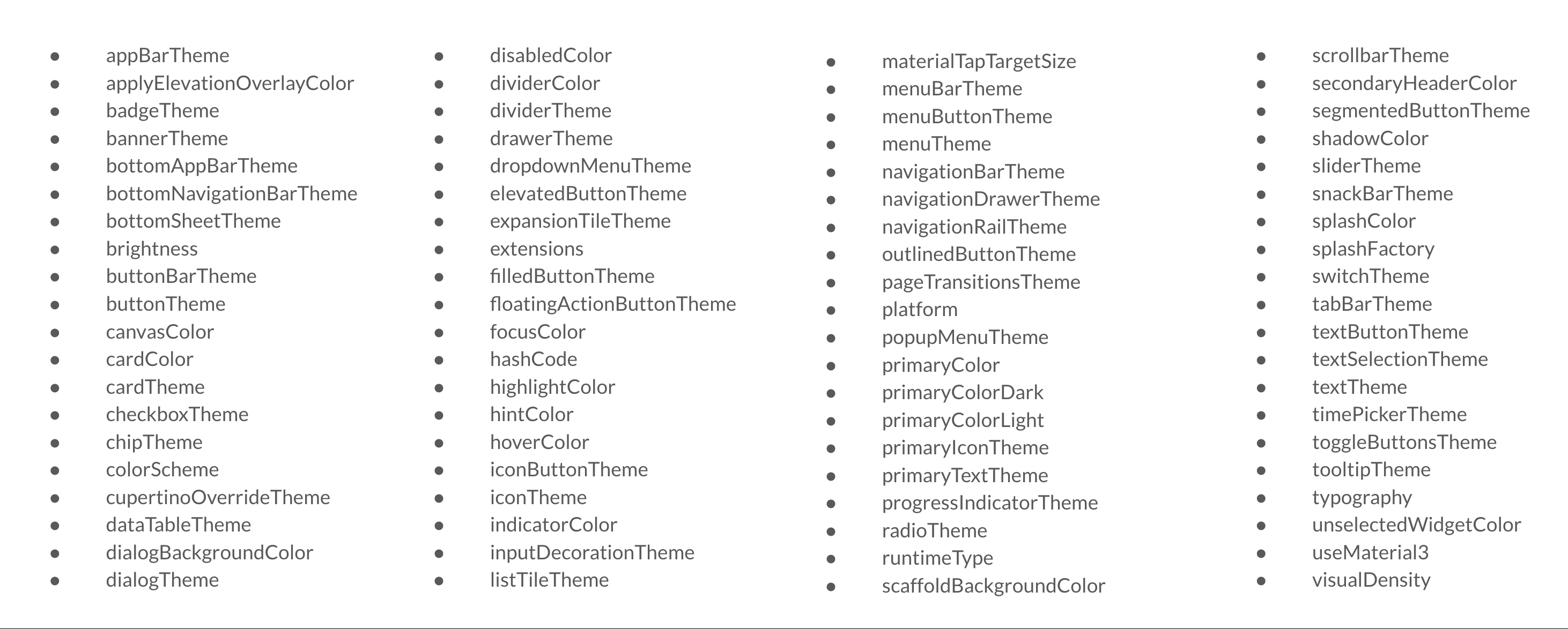
These are just the root-level properties, I even left out the deprecated properties that are still in there.
Let's do an extreme example. Let's think about the counter app again. Why would we need all these properties? If we want to add a dark theme, only a few of these properties will have to change.
Conclusion
I've tried to explain to you why I find theming in Flutter confusing. The way it's implemented and used across the Material Widgets doesn't make any sense to me.
I got a bunch of reactions with good suggestions on the tweet, and I also discussed this internally with my colleagues at Pinch on how to improve theming.
Both gave me ideas on how I want to try and handle theming differently. I'm currently running with an idea that I'd like to call "explicit theming" inside my pet project.
But it's too early to write something about it, so I'll let you know how that turns out.
Until next time!